20/09/11
Today we went through the basics of what Systems and Processes will cover in relation to Photography. We firstly talked about the three elements: visual irony, the decisive moment, and visual juxtaposition.
Visual irony is the use of elements in an image to convey a meaning that is opposite to the literal meaning of the main subject of the image.
The decisive moment is the exact moment a person has decided to press the shutter button to capture the image they have. For example, when a flock of birds fly into your landscape shot, you may make the decision to press the shutter button and capture their movement, or you may make the decision to wait until after they have passed and then press the shutter button.
Visual juxtaposition is when contrasted objects are pictured together but we are not fully aware of the reasons why.
Weekly Picture Project ♯1
In the first lesson we were given a brief to take several images in and around Blackburn. I think the idea was to get images with an idea of unexpectedness about them. I think the purpose was to get us experimenting with composition and to allow our tutor to see where we were technically with our work. We were advised to look at the work of Matt Stuart, a street photographer who, in my opinion, has an excellent eye for composition and makes extremely good use of the 'decisive moment'.

Above is an example of Stuart's work. This image is angled so that it looks as thought the dog is driving the car it is travelling in. This is visually ironic as a dog couldn't possibly drive a car, and is therefore effective in drawing the viewer in to look closer. The decisive moment has also been used very well here as the dog probably wouldn't have been in that position for a very long time, and the car certainly wouldn't have been there very long if it was moving. This means Stuart had to press the shutter at the exact moment the image looked like this through the lens.
Image source: http://www.mattstuart.com/photographs/colour/12-BARBICAN
27/09/11
Today we looked at and critiqued one anothers' images for our first weekly picture project.
Below are the images I produced using the brief we were given last week and the work of Matt Stuart for inspiration;

I had spotted the main element of this image before the brief had been given - the 'H' and 'O' coming together on the side of the bus stop to make the slang-word 'HO', an abbreviation for 'whore'. I then had to wait for someone to come along and stand in front of it that was suitable for what I was trying to get at. After taking it, I felt the image was both ironic and juxtapositional, as an old lady being a whore, or ho, is a generally ridiculous idea. When my image was critiqued by the class, I realised there were a lot of distracting elements to it that shouldn't have been there, e.g. the tree in the background on the left hand side, or the fact that the image isn't entirely straight - the post next to the old lady doesn't run parallel to the edge of the image.

This image made me think of the decisive moment. I was taking photos of everything and everyone around me when I saw these two and looked at them through my lens. Their matching caps caught my eye so I focused on them and waiting for something interesting to happen. The child sat up in his seat to watch his father, who was looking at his phone. This is when I pressed the shutter button as I thought it was nice that the child was looking up to his father and taking an interest. Again, when this image was critiqued, I realised I hadn't thoroughly considered my composition and because of this, a glance at the image could trick a viewer into thinking I had photographed four people when in fact I had only captured two, and the advert in the background was distracting.

This is my favourite image from the set and was meant to be a juxtaposition but you can't really see it properly as the object of juxtaposition is so small! There is a code lock on the cathedral door - I saw this as a juxtaposition as you would expect the cathedral to be a place that is respected and revered, yet here it is having to be protected from criminals such as vandals and thieves in this day and age. I also changed the contrast and brightness on the image in order to make it look more interesting and make some of the detail stand out better, e.g. the wood of the door and the mould on the brickwork. I was told this was my best image out of the three and that my composition was well placed but could have been better, perhaps by including a feature on the cathedral step, etc.
04/10/11
Today we learnt the basics of taking a photograph using a digital SLR. We began by looking at shutter speed and aperture, learning that they are inversely proportional - as you increase one you must decrease the other. We learnt that we can decide what is the priority when taking an image, i.e. capturing movement, focal range (depth of field), and light level. Shutter speed is important for capturing movement, e.g. a short shutter speed to capture a person jumping, or a long shutter speed to capture the movement of stars across the night sky.
We then learnt about several settings on our cameras;
Av (Aperture Priority)
Tv (Shutter Priority)
This is where you set the shutter speed to your desired number of minutes, seconds or fractions of a second and the camera then automatically selects the most appropriate aperture for the conditions you are shooting in. This setting is good for freezing or blurring the motion in a subject, and would be useful for capturing action, perhaps in sports, etc.
M (Manual)
This is where you have control over both the aperture and shutter speed and should be used in order to get the best possibly capture quality. It is useful but can only really be used effectively when you have a lot of time to experiment with various settings in order to find out what the best ones are for the subject you are capturing.

Above is an image of some daffodils by amateur photographer Per Foreby, whose work we were advised to look at for depth of field examples. This is an example of shallow depth of field, and reminded me of an image I took several months ago. I love this image as the flower in the middle of the image is so sharp and crisp, a good opposing effect to those in the background, and parts of the foreground flower, which are much softer and give a 'dreamy' effect to the image.
Below is the image I had taken myself several months before embarking on my course at university;

For this image, I used the longest possible focal length on my current (and only) lens - 55mm. I also used a reasonably wide aperture - f/5.6, and a shutter speed of 1/80. These settings allowed for a shallow depth of field in this image, which I like as it creates a nice bokeh effect for the background - the proper name for which I did not know until today's lesson. I also really like how the depth of field is so shallow the camera didn't even capture the entire flower in focus - only the closest parts of the petals (not even whole ones) are in focus. I love how the contrasting orange pollen of the flower still stands out despite being out of focus.
Weekly Picture Project #2
After learning in detail about depth of field, we were given a brief to take an image for the following week. We were told to take a black and white portrait and keep to the following guidelines;
- Use the longest focal length on your lens, e.g. 55mm
- Use the widest possible aperture, e.g. f/1.8
- Focus on the eyes
- Be careful about inclusion and exclusion (composition)
- Think about 'Bokeh' - the Japanese term for 'blur' or 'haze. In portraiture, it is useful to achieve this effect in order to blur the background and make the subject stand out.
We were also advised to look into the work of photographer Jane Bown for inspiration and help with this brief.

Here is a black and white portrait of the singer Sinead O'Connor in 1992, taken by Jane Bown. I love the shallow depth of field she has used to create a bokeh effect in the background, making Sinead's form stand out more as it is in better focus. I also really like how the eyes and nose are most in-focus out of the whole image, leaving the mouth and the rest of the head and face less focused, as they are naturally further from the camera due to the natural curvature/spherical shape to the head. I like the sense of depth the top of Sinead's head gives us, with the texture of the hair going from unfocused to focused as we look further back across her head. This gives her more form and shape, giving the whole image depth and ensuring she doesn't just look two dimensional. I feel the cigarette behind her ear gives the same effect and sense of depth as it looks like it is almost there for you to physically grab and take out of the picture; it is almost three dimensional.
11/10/11

At the end of this week's session we were also told that the weekly picture project would now become a fortnightly project in order to better prepare us all on the technical workings for each brief. Each week we will go through the brief and the theory we need to know in order to capture the required type of image, then the following week we will have an entire lesson dedicated to the critiquing of our images. This made me feel better about the projects as it means we will have more time to take in all the theory and it won't seem like as much of a rush.
Today we looked at and critiqued one another's images for the portraits brief we were given last week. Below is the black and white image I produced and presented to the class using the guidelines we were given and the work of Jane Bown as inspiration;

I used myself as a model for this image, because I couldn't find anyone else to do it during my busy schedule in the single week we had to take the image. For it, I used the shortest (and therefore widest) focal length on my lens - 18mm. I forgot about using a longer focal length in order to give a shallower depth of field. However, I did use the aperture priority (Av) mode setting on my camera and set the aperture to f/3.5 - the widest I could get it. From this, the camera set a shutter speed of 0.5 seconds, as the room I was in was reasonably dark and there was only a tungsten light bulb available. Because I took the image at night, there were no means of natural light, so I used the flash on the camera as well. I think I was careful about inclusion and exclusion as there isn't anything severely distracting in the background, plus it is blurred because of the bokeh effect the wide aperture has achieved. I love the bokeh effect as it really makes me stand out from the hazy background - particularly my detailed hair against the less-detailed wall. I also tilted my head in such a way that my eyes have been made to look very big and are the main focus of the image - as we were asked to focus on them. I don't think the image is fantastic - I was told in my critique that because I used a short focal length I could have risked making any other subject look 'ugly' because it would have probably emphasised their nose in an unflattering way. I only got away with it because I'm young and therefore my nose isn't at all prominent as it hasn't grown to its full size yet (the nose and ears continue to grow throughout a person's lifetime).
I feel that I could have gotten a better image if I had stuck to the guidelines more, i.e. used a longer focal length, natural daytime lighting, and I really feel it would have been better if I had gotten someone else in front of the camera instead of myself, so that I could have looked through the lens and gotten a more accurate view of the image I was about to take. I would follow the guidelines more closely if I were to do this picture project again.
I feel that I could have gotten a better image if I had stuck to the guidelines more, i.e. used a longer focal length, natural daytime lighting, and I really feel it would have been better if I had gotten someone else in front of the camera instead of myself, so that I could have looked through the lens and gotten a more accurate view of the image I was about to take. I would follow the guidelines more closely if I were to do this picture project again.
At the end of this week's session we were also told that the weekly picture project would now become a fortnightly project in order to better prepare us all on the technical workings for each brief. Each week we will go through the brief and the theory we need to know in order to capture the required type of image, then the following week we will have an entire lesson dedicated to the critiquing of our images. This made me feel better about the projects as it means we will have more time to take in all the theory and it won't seem like as much of a rush.
19/10/11
We were also advised to consider the 'rule of thirds' - a rule in which the image is divided into nine parts of equal proportions using two horizontal and two vertical lines. The main compositional elements of the image should occupy these lines in order to create a balanced composition.
We were told that we had the option to shoot a long exposure landscape to hand in for the brief. This could be done the best possible way by ensuring no camera shake, i.e. screwing the camera to a tripod weighted down with a bag of rocks and using a cable release/self timer in order to ensure no interference from the touch of the photographer on the shutter button.
We had also been told we could use a technique called hyper-focal distance - this is where everything from the main point of focus to infinity is included within the depth of field of that image.
We were also shown various photographers in relation to different types of landscape photography;
Commercial
Charlie Waite - British landscape photographer
 The images taken by Waite are all about aesthetics and the view presented to the audience - there is no particular meaning or story behind the image and the photographer is not trying to pass on a message other than; 'look how beautiful this is'. A quote from Waite's website about his images says, "Where the light, the colour, the shape, and the balance all interlock so beautifully that I feel truly overwhelmed by the wonder of it." I think these kinds of images are good for those who appreciate the beauty of nature in its raw form, but I also believe imagery should have a deeper meaning and a further story to tell.
Documentary
Walker Evans - American documentary photographer
 The above image was taken in Pennsylvania and shows a piece of history from an important period; the Great Depression. Landscape imagery within documentary photography has a purpose - it intends to capture and document a specific event/period in time so that it may be possible for future generations to see and experience as closely as possible the same event or period.
Image sources: http://d2whyjh24t36y9.cloudfront.net/gallery/lupe/020027.jpg
https://blogger.googleusercontent.com/img/b/R29vZ2xl/AVvXsEgxXSJ2HZl2uMFyI1DRXOXv4IgyVo1FHRaGRt5LrlcSZpPywL5x9juKZBLoct5lzb59eVsW_hkOPlOJ-6uSezohuWw-naTXiKBZhwOPbwvzHZpaWM95Wj3E3dEHPXcnbW_udIniRuegRnc/s1600/00231r.jpg
01/11/11


08/11/11


Weekly Picture Project #3
Today we were given the brief for our third weekly picture project. We were told we would be taking a picture of a black and white landscape at a location we found interesting or meaningful. We were given options as to what picture format to take it in;
- Landscape rectangle - the most traditional format, derived from the tradition of painting.
- Portrait rectangle - which can be used in landscape images to emphasise depth and create strong foreground elements.
- Panoramic rectangle - e.g. for a really lengthy view.
- Square - which requires a good eye for composition, as it must be carefully balanced.
We were advised to use the following to take our images;
- DSLR set to 200 ISO, RAW, Shutter priority (S, Tv) or Manual (M)
- Tripod
- Remote or cable release
- Polythene bag
- Tape measure
- Step ladder
We were also advised to consider the 'rule of thirds' - a rule in which the image is divided into nine parts of equal proportions using two horizontal and two vertical lines. The main compositional elements of the image should occupy these lines in order to create a balanced composition.
We were told that we had the option to shoot a long exposure landscape to hand in for the brief. This could be done the best possible way by ensuring no camera shake, i.e. screwing the camera to a tripod weighted down with a bag of rocks and using a cable release/self timer in order to ensure no interference from the touch of the photographer on the shutter button.
We had also been told we could use a technique called hyper-focal distance - this is where everything from the main point of focus to infinity is included within the depth of field of that image.
We were also shown various photographers in relation to different types of landscape photography;
Commercial
Charlie Waite - British landscape photographer

Documentary
Walker Evans - American documentary photographer

Image sources: http://d2whyjh24t36y9.cloudfront.net/gallery/lupe/020027.jpg
https://blogger.googleusercontent.com/img/b/R29vZ2xl/AVvXsEgxXSJ2HZl2uMFyI1DRXOXv4IgyVo1FHRaGRt5LrlcSZpPywL5x9juKZBLoct5lzb59eVsW_hkOPlOJ-6uSezohuWw-naTXiKBZhwOPbwvzHZpaWM95Wj3E3dEHPXcnbW_udIniRuegRnc/s1600/00231r.jpg
01/11/11
Today we viewed and critiqued the images we had taken for the landscape brief set last week. I went out to the locks located on the canal at Barrowford. This is a special place for me as it is where my boyfriend and I often take walks together. I feel my style here is documentary, rather than commercial, as I am trying to show people a period of time from my personal life, and it is not purely the aesthetics of the image that I am interested in. Below are the three black and white images I produced following the guidelines for this brief;

Originally, this image was my favourite of the three I selected to present, as I love the highlights we can see coming into the camera from the sun. I also really like the reflections in the canal which show the movement of the water and create interesting shapes within it. I like the extreme contrast between the horizon created by the trees and the pure-white sky. However, because the light is shining into/onto the camera and not onto the subject, this hasn't left much room for mid tones within the image, and so it is somehow lacking in depth and looks too flat. Perhaps I should have used a longer shutter speed to further expose the mid tones, however, this may mean the sky and water could be entirely bleached out.

Above is my least favourite of the three images I selected and I chose it more for the subject matter than the quality of the image I had produced. I felt that this was my best attempt at using the rule of thirds, as the horizon and the clouds break up the image in third horizontally, for me. The locks themselves are supposed to be black, but because of the low autumn sunshine, they are overexposed and therefore look as though they are grey. To be honest, the entire image is a bit too grey for me, and there isn't enough pure black and pure white within it. I feel that I should have used a smaller aperture for this image, perhaps then my depth of field would also be better.

Above is what turned out to be my favourite image out of the trio, as I didn't realise how good it was until I presented it to the class, and was made to see this was the best of the three. Again, I love the highlight created by the sun coming toward the camera. And this time, the light isn't going directly into the camera, meaning the mid tones have turned out nicely as well. I love the stillness of the water and how perfectly the shapes of the reflections contrast against the almost pure-white canal. The only thing that bothers me about the image is the slight flare located in the bottom right-hand corner of the image. I tried to prevent this using my hand to shield the lens, but my attempts failed. Perhaps I should invest in a lens hood for images like this in the future.
If I were to repeat this week's picture project, I would like to attempt to use hyper-focal distance, which I didn't try this time around because I still don't fully understand how to achieve the effect using my own camera.
08/11/11
Weekly Picture Project #4
This week we were set our fourth picture project. This project was in relation to still life photography. In particular, we were told, a vase of flowers. We looked at the work of several artists, including both photographers and painters.
We began by looking at Robert Mapplethorpe, an American photographer who had two main themes to his work - flowers and sexuality. It is widely believed that his work on flowers is also full of sexual undertones.

For example, without being too descriptive, it is somewhat obvious that this flower looks remarkably like the female genitalia. Flowers are often described in this way and so perhaps this is why Mapplethorpe began using them within his images.

And in this image, the way the flowers are presented looks almost phallic (or at least it does to me!). Perhaps Mapplethorpe intended to show how flowers and sexuality can be linked.
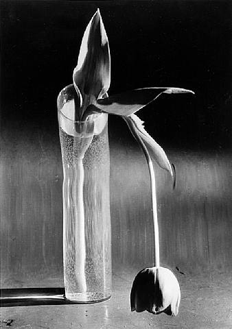
We also looked into the work of André Kertész, a Hungarian photographer famous for his contribution to image composition.

Above is an image by Kertész entitled 'Melancholic Tulip'. Some say this image is reflective of Kertész' isolation, even down to the title. The solitary flower drooping towards the bottom of the image looks very gloomy and dejected. Kertész once said “I interpret what I feel in a given moment. Not what I see, but what I feel.” Perhaps for my own still life images I will be able to interpret what I feel and place it into an image with a simple yet effective composition like this one.
We were also asked to concentrate on several techniques for this week's project;
- Macro, in which your lens can reproduce the subject at a life-sized image.
- Colour temperature - ensuring your camera is set to the right White Balance setting for the main light source on your subject.
- Light - photography is about recording the way things look as light falls on them.
- The aesthetics of the vase and flowers.
Image sources: http://images.artnet.com/artwork_images_230_14233_robert-mapplethorpe.jpg
http://www.ursusbooks.com/thumbnail.php?img=./itemimages/121081a.jpg&maxwidth=700
http://www.ursusbooks.com/thumbnail.php?img=./itemimages/121081a.jpg&maxwidth=700
15/11/11
22/11/11 - given great British brief
29/11/11

06/12/11
13/12/11

 ^After^
Here is a list of the changes I made to the image;
In today's lesson we viewed and critiqued our images for the vase of flowers brief. Below is the image I selected to present to the group;
 I originally had the idea of smashing a vase of flowers in order to create an interesting and dramatic effect within my image. However, the images from this did not turn out the way I had hoped they would and so I tried another approach. I simply arranged a set of colourful flowers within a small glass vase and set it against a plain black backdrop. I decided on natural lighting and also used a wide aperture (f/5.6) and a reasonably slow shutter speed (1/30) as there wasn't all that much daylight available during the afternoon. For this reason, I also used the flash in order to give the foreground flower more highlights and to make it even more prominent from the background flowers. I really like the bokeh effect created by the use of a wide aperture. Ialso like how the vase glistens slightly to add a little more colour and effect to the image.
I would have liked for my smashed vase images to have worked, but I'm still very pleased with the image I have produced, and the fact that it was well received in class.

I would have liked for my smashed vase images to have worked, but I'm still very pleased with the image I have produced, and the fact that it was well received in class.
Weekly Picture Project #5
For this week's picture project we were given the theme of 'Great British'. We looked at several well-known British photographers and their work relating to the 'Great British' theme. We began by looking at Tony Ray Jones - a British photojournalist famous for his work in Britain between 1965 and 1970.
 Here is an image taken by Jones of a beauty contest in Southport in 1967. The image, taken in a typical British town, has a certain patriotic theme to it. The typical 'British gentleman' in amongst all the chaos, sipping a good old British cup of tea.
We also looked at a work by Mark Power, entitled 'The Shipping Forecast'. This was inspired by the shipping forecast which is broadcast four times per day every day on BBC Radio 4. The images were taken over a three-year period in various locations on the British coast. Each image is captioned with the earliest shipping forecast for the day it was taken.
 Above is an image by Jones with its shipping forecast caption. Perhaps the objective of this project was not to see if the shipping forecasts were accurate, but to show that our assumptions of the British coast and the various locations included within the project are not necessarily accurate. Perhaps I will be able to create my own images (in response to the Great British brief) with an effect similar to this, to challenge ideas, preconceptions and even stereotypes people have of the British and their country.
We then looked at the work of Martin Parr - a British documentary photographer and photojournalist.
 The above image by Parr is one that oozes British heritage. An ice cream van in the background, an old person on a deck chair, and a British flag directly in the foreground. The flag is also covering her face, making her into the typical British pensioner rather than identifying her as a single person with her own unique features. She is part of a British persona.
For this week's picture project we were given the theme of 'Great British'. We looked at several well-known British photographers and their work relating to the 'Great British' theme. We began by looking at Tony Ray Jones - a British photojournalist famous for his work in Britain between 1965 and 1970.

We also looked at a work by Mark Power, entitled 'The Shipping Forecast'. This was inspired by the shipping forecast which is broadcast four times per day every day on BBC Radio 4. The images were taken over a three-year period in various locations on the British coast. Each image is captioned with the earliest shipping forecast for the day it was taken.

We then looked at the work of Martin Parr - a British documentary photographer and photojournalist.

Image sources: https://blogger.googleusercontent.com/img/b/R29vZ2xl/AVvXsEgiTMeYE7Yss2drMU6W8Mm5UMpKv0A6uR4WWkuwpLkdisstlwoivLwoFG1RNRpq9JjhINRjaqq4OtbRcuWZ3j03dcpN6He9m7zKujA3ptegh3pmeQnd_4L-ADfldHtxPQJ8jyPa13m0l3TN/s640/Tony-Ray-Jones-003.jpg
http://www.markpower.co.uk/Photographic-projects/THE-SHIPPING-FORECAST
https://blogger.googleusercontent.com/img/b/R29vZ2xl/AVvXsEgf2hEb17sy6w5RjpvhbM_kgv6zITFvexMGs2DKtSoMtzdaaoSJjJ2_2z062qtvsA-FaauhlAJczIqVSkEG3Lm31QS3-ja_kSxg8ZYkr-uxd1vBP6a-0JLzZkkMxuY6axQDfBBcy9AtSWM/s1600/martin_parr.jpg
http://www.markpower.co.uk/Photographic-projects/THE-SHIPPING-FORECAST
https://blogger.googleusercontent.com/img/b/R29vZ2xl/AVvXsEgf2hEb17sy6w5RjpvhbM_kgv6zITFvexMGs2DKtSoMtzdaaoSJjJ2_2z062qtvsA-FaauhlAJczIqVSkEG3Lm31QS3-ja_kSxg8ZYkr-uxd1vBP6a-0JLzZkkMxuY6axQDfBBcy9AtSWM/s1600/martin_parr.jpg
Today we viewed and discussed each other's images for the 'Great British' brief. Below is the image I created for the brief;

Above is an image of an iconic British structure - Blackpool Tower. This screams British culture and is well known all over the world as a symbol of our country. The problem I have with this image and the rest of the set is that they are very blue because I left the White Balance setting on my camera on 'Tungsten' from a previous shoot. However, I do like the composition and I feel the image is divided rather nicely into rough thirds with the top of the tower and the white scaffolding that appears part of the way down the tower. I also like that the tower is almost dead center of the image but I feel it does not stand out enough from the sky because of the White Balance error. I did try changing the levels in Adobe Photoshop but I still did not manage to get my desired image.
06/12/11
Weekly Picture Project #6
In today's lesson we went through some image editing theory in relation to improving our own photos. We looked at various techniques and how they could be used on images;
- Black and white conversion, using channel mixer rather than 'desaturation'
- Levels - used to change shadows, highlights and brightness
- Cropping - in order to improve composition
- Layers - so that actions can be separated so you can see your changes and control them more efficiently
- White balance - to create of remove colour bias in the image
- Resize - to change image dimensions and resolution
- File types - to format for printing
- Dodging and burning - to lighten/darken areas of an image
- Cloning tool/healing brush - to rid the image of any unwanted marks or features
- Sharpening - to make the image appear sharper
- Gradient tool - to give a smooth tone to skies, etc.
- Creative borders, using selections and filling tools
- Curves - to control the contrast of the image
- Image mode/bit depth - duotones, changing the bit depth
For this week's picture project, we were asked to edit an image using at least ten of these tools/techniques, in order to show our understanding and usage of the Photoshop software.
13/12/11
Today we looked at each other's images produced for the edited image brief. Below is what I created from a previous image;
^Before^

Here is a list of the changes I made to the image;
- Levels
- Curves
- Feather
- Lens correction
- Magic wand tool
- Black and white conversion
- Image sizing
- Sharpening
- Creative borders
- Cloning